


Introduction
Hi !👋
Today, I will teach you a way to make a fully functionnable toggle using Formik and React.
I looked online for a simple way to do it and I came across several libraries to do it and I was frustrated because I felt it was rather exaggerated.
If you want to just see the code go here.
Disclaimer : This is a just a way that suits my needs. In addition, I'm still a newbie and looking for improvement so my code won't be the cleanest and I apologize for that.
No more talking, let's dive in !
The Structure
Formik
Note : I will reference each element by his class names
The strategy for making the component is straight forward: We create two radio, checkbox in a group because if one checkbox is checked the other is not. We create a div which is the indicator (selector) of what options has been chosen. As simple as this.
Firstly, you need to install Formik as such:
npm install formik --save
Don't forget to import the library :
import { Formik, Form, Field } from "formik";
In order to create a Form we use and Components as such:
<Formik>
   <Form className="form">
   </Form>
</Formik>
Then we make two for the email and password:
<Formik>
   <Form>
      <input type="email" name="email"  className="fields" />
      <input type="password" name="password"  className="fields"  />
   </Form>
</Formik>
Toggle Component
Note : I will reference each element by his class names
Now we start the toggle component:
<Formik>
   <Form className="form">
      <input type="email" name="email" className="fields" />
      <input type="password" name="password"  className="fields"/>
      <div className="toggle">
      </div>
   </Form>
</Formik>
Wrapping up all our elements into a toggle wrapper makes it easier for the CSS:
<Formik>
   <Form className="form">
      <input type="email" name="email" className="fields" />
      <input type="password" name="password"  className="fields"/>
      <div className="toggle">
         <div role="group" className="toggle__wrapper" >
         </div>
      </div>
   </Form>
</Formik>
We add a div to contains our toggle options and our toggle fields.Also we have label in order to show our option then the component from Formik :
<Formik>
   <Form>
      <input type="email" name="email" />
      <input type="password" name="password" />
      <div className="toggle">
         <div role="group" className="toggle__wrapper" >
            <div className="toggle__options">
               <label className="toggle__field" >
                  <Field type="radio" name="CatsorDogs" value="false" />
                  Cats
               </label>
               <label className="toggle__field" >
                  <Field type="radio" name="CatsorDogs" value="true" />
                  Dogs
               </label>
            </div>
         </div>
      </div>
   </Form>
</Formik>
We need to indicate clearly which options is chosen to the user :
<Formik>
   <Form>
      <input type="email" name="email" />
      <input type="password" name="password" />
      <div className="toggle">
      <div role="group" className="toggle__wrapper" >
         <div className="toggle__options">
            <label className="toggle__field" >
               <Field type="radio" name="CatsorDogs" value="false" />
               Cats
            </label>
            <label className="toggle__field" >
               <Field type="radio" name="CatsorDogs" value="true" />
               Dogs
            </label>
            <div className="toggle__selector" />
            </div>
         </div>
      </div>
   </Form>
</Formik>
Last but not least the button for submitting the form:
<Formik>
   <Form>
      <input type="email" name="email" />
      <input type="password" name="password" />
      <div className="toggle">
      <div role="group" className="toggle__wrapper" >
         <div className="toggle__options">
            <label className="toggle__field" >
               <Field type="radio" name="CatsorDogs" value="false" />
               Cats
            </label>
            <label className="toggle__field" >
               <Field type="radio" name="CatsorDogs" value="true" />
               Dogs
            </label>
            <div className="toggle__selector" />
            </div>
         </div>
      </div>
      <button>Submit</button>
   </Form>
</Formik>
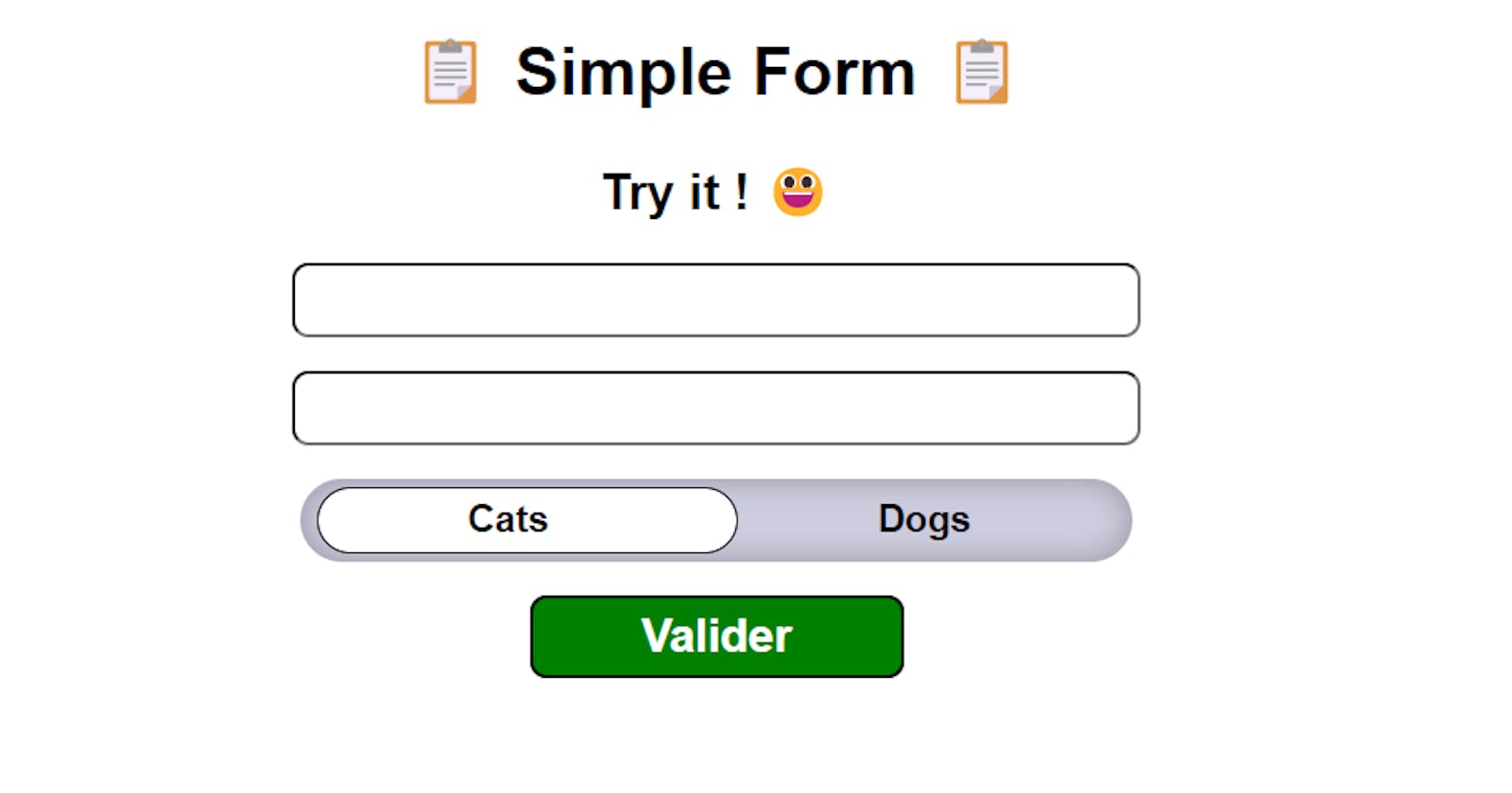
🎉Congratulations, you have your skeleton ready !
The Style
Note: The CSS class are following the BEM naming conventions
Form Style
In order to get our toggle to look as we want we need to create some CSS class.
This is some CSS that I included that is not related directly to the toggle.
.App {
  font-family: sans-serif;
  text-align: center;
}
.form {
  display: flex;
  flex-direction: column;
  align-items: center;
  gap: 16px;
}
.form .fields {
  width: 400px;
  height: 30px;
  border-radius: 8px;
}
Toggle Style
This is a visual representation of the toggle :
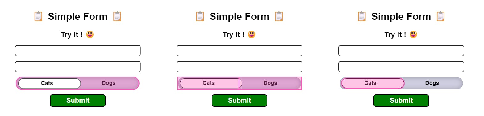
We follow the logic of our skeleton :
- The toggle wrapper
- The toggle options
The selector
Starting by the toggle class itself:
.form .toggle {
  width: 400px;
  height: 40px;
}
Then the toggle__wrapper class as the name implies it wraps all the elements:
.toggle .toggle__wrapper {
  width: 400px;
  height: inherit;
  display: flex;
  flex-direction: row;
  align-items: center;
  position: absolute;
  border-radius: 20px;
  background: #cdcddf;
  box-shadow: inset 0px 0px 14px 1px rgba(0, 0, 0, 0.25);
}
Then we have the div that wraps the toggle__options. Here we use a CSS grid in order to have our text centered no matter what the content is:
.toggle__wrapper .toggle__options {
  z-index: 1;
  width: inherit;
  display: grid;
  grid-template-columns: repeat(2, 1fr);
  text-align: center;
}
We then go to the selector which is the element that will go left and right to indicate which element is selected. It is important to check for the z-index as it is the property that allows the selector to be between the background and the field text:
.toggle__wrapper .toggle__selector {
  z-index: 0;
  width: 200px;
  height: 30px;
  position: absolute;
  top: 4px;
  left: 4px;
  border-radius: 18px;
  border: #000 1px solid;
  transition: all 0.5s;
  background-color: white;
}
We suppress the original look of the checkbox fields then add our style:
.toggle__options .toggle__field input[type="radio"] {
  position: fixed;
  opacity: 0;
  pointer-events: none;
  border: 1px solid #000;
}

.form .toggle__field {
  z-index: 1;
  padding: 5px 50px;
  font-size: 18px;
  font-weight: 600;
  font-family: Spartan, sans-serif;
  text-align: center;
  cursor: pointer;
}
And Finally we have the submit button :
.toggle__wrapper .toggle__selector {
  z-index: 0;
  width: 200px;
  height: 30px;
  position: absolute;
  top: 4px;
  left: 4px;
  border-radius: 18px;
  border: #000 1px solid;
  transition: all 0.5s;
  background-color: white;
}
🎉Your style is complete, just one more step !
The Logic
The logic here is very simple,we write a function to animate the selector on the click event.
Three simple steps :
- Instantiate a state
- Create the animate function
- Add it to the Fields
- Instantiate values and submit behavior of Formik
Basically, we create a state which gonna store a value and we will use the CSS transform attribute and animate it. The CSS transform allows use to make the selector back and forth
Step 1 :
const [translate, setTranslate] = useState("3");
Step 2 :
Note : It is very important that you change "Cats" to your first option
  const animate = (e) => {
    e.target.value === "Cats" ? setTranslate("3") : setTranslate("180");
  };
Step 3: Add the initialValues and onSubmit attributes like this:
  <Formik
        initialValues={{
          email: "",
          password: "",
          CatsorDogs: ""
        }}
        onSubmit={(values, { setSubmitting }) => {
          setTimeout(() => {
            alert(JSON.stringify(values, null, 2));
            setSubmitting(false);
          }, 400);
        }}
      >
Add the onClick attribute to each radio Field :
<Field type="radio"
             name="CatsorDogs"
             value="Cats"
             onClick={(e) => {
             animate(e);
             }}
 />
<Field type="radio"
             name="CatsorDogs"
             value="Dogs"
             onClick={(e) => {
             animate(e);
             }}
 />
And finally the Selector:
<div className="toggle__selector" style={{ transform: `translateX(${translate}px)` }} />
🎉Now your component is ready to work !
The End
Now you know my way of doing it ! If you liked let me know and have a nice day !
Here is where you can find the Code sandbox I made.